Thursday 3 May 2012
Monday 30 April 2012

ALL - Digipak Final
We now have a completed Digipak which can be seen below.
Front Panel (and spine)

Back Panel


Front Panel (and spine)
Back Panel
Inside Panels
Sunday 29 April 2012
Evaluation Question 4
How did you use new media technologies in the construction and research, planning and evaluation stages?
Creating a music video, a digipak and a magazine advert has given us a great opportunity to use a wide range of media technologies. This chance has allowed us to build up a huge variety of skills that will benefit us in the future and have benefitted us during this process. As well as the creation of the three products, we have had to use technology in each part or phase of the whole course, for example the Research & Planning phase and the Evaluation phase.
There are a number of different media technologies that we have used throughout the process. These can be broken down into sections of where we used each individual piece of technology:
Production:
 Final Cut Express - Using Final Cut Express has been the biggest change and challenge between our AS Foundation course and our A2 Advanced course. It is a far better piece of software than iMovie for the task we had in hand, but is also far trickier to get used to and to use to the top of its potential. The increased amount of transitions, effects and tools on the program make it far superior and a real advance on iMovie in my personal opinion. The key reasons that it is much better for making something such as a music video is that the effects available are far more professional and varied than they are on iMovie, where they are often quite unrealistic and do not seem appropriate for a professional piece of work. Final Cut Express also allows more accurate and precise 'cuts' with the cutting tool than iMovie. Another and very significant advantage of FCE is the ability to use and create layers in a video which is a vital aspect to music videos and is very fitting to our idea.
Photoshop - Another piece of software that we have had to use throughout the course is Photoshop, which we needed to create our ancillary texts. By using Photoshop we were able to create a professional looking piece of work for each panel of our digipak and the magazine ad. Using such software allowed us to create draft attempts and quickly make alterations that feedback suggested. An example of this came about during feedback on our digipak when somebody suggested we changed a font on the back panel. Through Photoshop we could quickly change the font so that we had an example of what it was like before and what it was like after. We could then ask for which people preferred. If for example, we had designed the product by hand then this would have been very tricky both to replicate the original exactly and to do it so quickly and simply. By using this technology you can also create a really neat and professional product, which we feel we did.
HD Cameras - We were lucky enough this year to have access to HD cameras, a real improvement on the DV Cameras that we used last year. This technology advance allowed us to capture better footage and to focus on more detail. This was very useful for filming and the visual effects are blatant in our footage. Particular shots in our video in emphasise the importance of this improved camera, for example when we use a panning shot to look at the music posters on the wall and when our protagonist is picking up stones to throw in the river. It is without doubt that the camera adds to the effectiveness of the video and make it look more like a real world product.

New Technologies have been of vital importance for our production of our video, magazine advert and digipak. They have certainly given all three products a more professional look and feel about them, without which they may have looked less impressive and poor, emphasising the importance of using the best technology available to you in this part of the course.
Research:
 Google Search Engine - Google is a huge tool internationally and is one of the easiest and fastest ways of having access to huge amounts of information. This has been a great asset to us throughout the research and planning phase of this project. It has meant that we have had quick access to information and examples (of magazine adverts, digipaks etc) that we would otherwise have had to pay for (which would have meant needing a bigger budget). There are numerous examples of where we have used this tool throughout the creation, planning and evaluation stages, but it was of key importance in the research phase, for example for finding information about the genre, examples of real world products and general information about the format in general.
Online Forums - There are a number of online forums for the band Muse allowing fans to spread information, videos and stories about the band. They also discuss all things about them, for example songs, lyrics and live performances. This came in useful when we were trying to work out the meaning behind the lyrics. We began the task by looking at such forums to see the views of fans of the band and see what a general consensus was as to the meaning of the lyrics. Online forums also came in useful for the feedback stage with the possibility to post our own rough cuts and sample scenes to these websites.
Official Websites For Our Band - These were very important when we were trying to establish facts about the band early in the project. By using their official sites we could work out how they work and see examples of their own work. This was vital so that we could try and successfully pinpoint our target audience as well as seeing how the band target their audience in the real world and with real world products. This allowed us to keep our ideas realistic, information factual and products in line with those produced by our band to date.
Post Production:
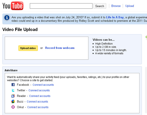 You Tube - Audience feedback and spreading word of your work is vital for the success of any product. In years gone by getting your work to a wide audience would have cost a lot of money, time and would have been very difficult to do. However with new technologies and in the modern day, sites such as You Tube have given media producers such as ourselves an outlet to screen our work and to show it to audiences across the world. This gives us an increased view from our target audience that we otherwise would not receive. Put simply without new technologies and the emergence of such sites as You Tube and Vimeo, it would be very difficult for very low budget media producers to get any kind of audience to view their work in the way we now have access to.
Facebook/Twitter Pages - Social networking sites Facebook and Twitter were another way we took advantage of the ever improving media technology. Through creating pages on both of these we were able to discuss where we were in the project and show footage to people who were interested in our work, in other words members of our Target Audience! Without being able to do this people may not have known what was happening in our production and may have lost interest; Facebook and twitter helped prevent this from happening.
Evaluation:
Making Videos - Modern technology has enabled us to make videos for our evaluation questions and show off our ICT skills. It is not long since that this would have been very difficult and in some cases impossible to do. This part can be linked in with the use of iMovie as well as using cameras. New Technology in the media industry has allowed us to use more inventive methods to put information across and showcase our ability. This is the aim during the evaluation phase.
Voiceover - With recording technology as it is now, we are able to record voices either separately or at the same time as recording the video. This means that we can combine the audio with visuals to show specific examples of what we are talking about. This also comes down to editing and technologies involved their.
Summary.
Technology available to us has enabled us to make music videos to a high standard. Without such high quality equipment at each stage this whole process would have been made infinitely harder than it was for us. Some of the equipment we have had access, in particular the editing software of Final Cut will be used by real world media industries to edit their work. This has been a significant development for us in the course this year, moving on from the more basic iMovie software that we used last year. Whilst we haven't had the obvious advantages that come with a big budget like in the real world, where they can take advantage of equipment such as lighting rigs, we have had as much assistance as we could possibly have hoped for for little to no money. This has meant that we have had to take advantage of free media technologies available to us, such as You Tube and the internet. This has been a positive thing however as it has helped us to become quite resourceful and helped us to learn how to search and find things that we need with limited to no funding.
Evaluation Question 3
What have you learned from your audience feedback?
Target Audiences
 |
| Origin of Symmetry |
Something that we needed to put a lot of consideration into for our project was our Primary Target Audience and our Secondary Target Audience. Our idea pretty much from the outset
was to rebrand the product for a predominantly male, youth audience, with the specific age range being 15-24. The reason for this was because the song, accompanied by a video, was originally released in 2001 on the Origin of Symmetry album. With that album now being ten years old it seemed an appropriate time to try and re-brand the video with the digipak and magazine ad for a youth audience. There is also the idea that as Muse became more and more popular, their music moved further and further towards mainstream music (leading to them being branded "sell outs") and therefore appealing more to a youthful audience.
 |
| Game Footage in our video |
How we recieved feedback...
There were a number of different ways in which we looked to recieve feedback on our work throughout the project. These ways were quite varied, with each one having different possibilities as to who we may recieve the feedback from.
Classmates - Arguably best and most influential feedback we recieved was from fellow people in our class. At regular intervals through the course we have had the opportunity to screen sample scenes and rough cuts to people in our class. This has been helpful for a number of reasons, not least the fact that they are all aged seventeen or eighteen and are therefore within our Primary Target Audience age range. It has also been very helpful as they are all creating music videos of their own meaning they understand the difficulties associated with the filming and editing phases, and have an understanding of what is possible and what is unrealistic for their suggestions.
| Facebook Logo |
Twitter - Like Facebook, we have created a Swillob Productions Twitter page. From here we have had the chance to post our work and recieve feedback from people who "Follow" the page. Anybody who follows the page is likely to have some interest in our video and are therefore likely to suggest improvements for us to work with.
| Twitter Logo |
Summary of overall feedback
Through recieving feedback we have tried to alter our work to support any ideas that we agreed with from audience feedback. Over the course of creating our three products some huge changes have been made as a result of feedback, whilst other parts of feedback have been considered, but ultimately dismissed.
Video
The main changes made in reaction to feedback have come in our music video. The original idea was to have a combination of Narrative and Performance aspects to the video which has always remained the same. The narrative idea has however changed quite drastically over the course of the project, although it still has the same basis of a protagonist who is a huge fan of the band. A quote from a post by Rob Shaw can give the foundations that began our idea:
"The narrative side of the video will be based on the songs lyrics, the protagonist is unsettled with himself and is envious of another person who is settled with himself. The protagonist wants to take away this persons perfection so that he doesn't feel envious. There will be shots of the protagonist using high angles to show his weakness and low angles on the other person to show his power. For the protagonist to be envious I want it to show him doing poor in his exams whilst the other character does better, he gets a girlfriend the the "pro" doesnt, he recieves awards in assembly whilst the "pro" doesnt and the class clap/cheer for his sucess whilst he is jealous of his sucess." [Click here to see the full blog post by Rob]
From this quote it is clear to see a huge number of differences between the original idea and our finished version. Whilst we have kept the basis with the "muse nerd" protagonist idea, a number of the surrounding ideas have changed a lot. The main alterations made to our video can be seen bullet pointed below:
- The original idea was to have a social group which the "muse nerd" protagonist was trying to fit in with. Quite early on, following sample footage one, we received audience feedback saying they did not feel this idea worked and did not come across very well in the footage, finding it quite confusing as to what was happening.
- This meant that we switched to the bullying aspect and put more emphasis on this, which in turn was altered due to audience feedback. Following a few more additions of sample footage being filmed, the overall consensus was that this didn't work with the actors available to us. It was also thought that this seemed quite a weak idea and that something such as isolation created a much more interesting and professional looking video. We were also given videos to look at within our genre (Jesus of Suburbia - Green Day and Jeremy - Pearl Jam) that included an aspect of isolation. This meant that we also had evidence that this kind of idea was used in the genre and therefore that there was an existing audience for the idea of isolation.
- Individual scenes and ideas were also scrapped, altered or kept in the video on the basis of how our audience reacted. Certain scenes that we filmed at school (Sample 3 - In the corridors for example) were considered ineffective and quite poor in our audience feedback. The reasons included things such as a lack of shot variation which would have been exceptionally hard to alter due to limited space. Because it was something that we couldn't really change, and the scenes we had didn't work, this scene was scrapped from the idea. There were a number of scenes that were altered for our video. These often included the settings that we used. An example of this can be seen in the comparison between sample footage 1 and our final edit. In both versions we have included scenes at a local skate park. Feedback suggested the setting worked in sample 1, but the scenes we filmed didn't. With our new idea we returned to the same setting and filmed some very different clips showing the protagonist's isolation. This shows one example of alterations made as a result of Audience Feedback. There were also a number of scenes and idea that were kept for the final edit following the original filming as a result of feedback. Examples of this include the aspects of gaming that we used, scenes such as the protagonist waking up and once we began to look into it, the idea of isolation was used throughout.
- During feedback early in the project we were told that our footage looked like it may suit a "a day in the life" type video. This was something we considered following this feedback, before eventually moving away from this idea again. It does however show that we considered and discussed all the feedback we received, but did reject some ideas after exploring all options available to us.
So far I have mainly been referring to the feedback that we have received on our music video. We did also need to receive feedback on our ancillary texts though. This is discussed below.
Digipak Feedback
Like with our video, the Digipak didn't simply fall into place and we didn't take our first attempt as the finished thing. Over the course we have looked at a large number of examples, deconstructing and analysing many of them to establish typical conventions of digipaks, much like we did with videos.
In the real world, the design and particularly the cover would be very influential on the number of sales that a product such as this would receive. For this reason we knew we had to create an eye-catching, professional looking and interesting product. We also knew that it needed to be appealing to our target audience and that they would immediately be able to recognise the product.
To help with this we asked people within our target audience to feedback on our products as we went along in the course. Below I will outline the main points from feedback received for our second draft of the Digipak (Front/Back Panels and Inside Panels) :
Front Panel:
The inside panels of our digipak didn't receive as many compliments as the front and back panels, although the feedback was still generally positive and helpful. The first point above was one that was debated quite a bit. We considered making the image more clearer, but felt leaving it as it is blended in well with how points two and four suggested we should keep the panels with it being more sci-fi and less realistic. We also felt that this really helped to signify the confusion in the protagonist's mind. For point three we considered the idea, although decided to stick with the same ideas for each panel. The reason for this was that from the examples we looked at, linking the two outer panels together and a common theme for the two inner panels was quite common. It isn't unusual to see links between every panel, but in this case we wanted different designs so that we could use different effects and showcase a whole range of skills. We also felt the contrast between the outside and inner panels worked well as a combination and didn't want to take this away by combining the two ideas.
In the real world, the design and particularly the cover would be very influential on the number of sales that a product such as this would receive. For this reason we knew we had to create an eye-catching, professional looking and interesting product. We also knew that it needed to be appealing to our target audience and that they would immediately be able to recognise the product.
To help with this we asked people within our target audience to feedback on our products as we went along in the course. Below I will outline the main points from feedback received for our second draft of the Digipak (Front/Back Panels and Inside Panels) :
Front Panel:
 |
| Front Panel of our Digipak (before changes) |
- Downsize the circular sticker and move it to the top right where there is an empty space
- Make sure all logos are in line with each other
- The wording could be improved (eg. bottom right corner box)
- Too much orange?
Overall the feedback for the front panel was positive, with people suggesting that the design and background image worked quite well. We were happy with this as we liked the design that we had chosen and thought it worked well, was representative of key themes in our video as well as relating to examples that we had seen in real world products (the idea of a shot from in front on the front panel and behind on the back panel, such as on the cover for Linkin Park's Minutes to Midnight). The points that we were told needed improving were generally things we agreed with. As you can see above they are mainly regarding the positioning of certain things on the cover, adjustments to which are easy to make with the technology available to us. The feedback also left us with a number of dilemmas, for example some people said there seemed to be too much orange whilst others thought this worked well. In the end we sided with the people who said the colour worked well as it is representative of the mood in our video, but also because it is the colour of the Origin of Symmetry album, on which the song was originally released.
Back Panel:
 |
| Back Panel of our Digipak (before changes) |
- Try and line up the URL's with the logos for Facebook and Twitter
- Maybe advertise as a bonus CD rather than bonus tracks
- Include a Behind The Scenes and a Full Live Performance with venue and date on as it is Special Edition - needs to stand out from the original to sell to the Target Audience who may have the original.
- Try the same colour scheme for the font as is seen on the front panel. Maybe ask for feedback as to which version works best
As with the front panel, much of the feedback was in reference to the layout and what was included in the writing. The design, with it being similar and linked to the front panel, again received positive feedback. We did try and make the changes suggested to make the layout of our digipak more impacting on the target audiences eye and to make adjustments to anything they didn't see as realistic. With many of the issues raised regarding what we were saying on the back cover, for example the track listing, this wasn't a massive problem and we could quickly make changes to.
Inside Panels:
- Make the shots of protagonist larger and/or clearer
- Try make a background image on the corridor look out of place to fit in with sci-fi theme.
- Try link the inside panels to the outer panels more
- Move further away from realism, more to Sci-Fi idea
 |
| Inside Panels of our Digipak |
Magazine Advert Feedback
Feedback for our magazine advert was again very encouraging, with certain things attracting attention that needed to be changed.
We began the construction of our magazine ad by designing and planning ideas on paper. We created a number of outlines and very basic design ideas for our magazine ad to get a really rough idea of what we wanted to put where on the final idea. Our decisions at this point, such as what to include and where to position them, were based on the examples of real world products that we had looked at. We could then show people within our target audience these designs to get an early opinion on whether they thought these ideas included everything they would want to know from a magazine advert. Following this stage we experimented with effects and ideas on photoshop. We then managed to create a magazine advert by using the information we had gathered and a screenshot from the game mass effect; the main talking point about feedback we received.
The majority of the feedback was very good for our magazine ad with only one real issue surrounding it. Because the background image was an unedited screenshot, it wasn't really our image and therefore wasn't acceptable for us to use for our advert. This was the main change that we were forced into making, with the rest of the advert working effectively.
Is the final version simply our version?
The answer to this question is the same for each product and is quite simply, no. Audience feedback has been hugely influential at all times in the project with a number of ideas being directly influenced and taken from the great feedback we received. From suggestions on videos to watch, to things we should alter in each of our products, the audience feedback has been behind most of the decisions that we have made through the whole product. Without the feedback we may have kept to an idea similar to the one we started with which is massively different from our final idea. For these reasons I would say that this video is not simply ours, but a reflection on our target audience and the ideas which they saw in the rough cuts and samples of works that we showed them, as well as the ideas they had simply from life experiences of their own. This is something that you would expect to see even in real world media products, with the audience and the preferred readings being vital influences in the final products released.
Evaluation Question 2
How effective is the combination of your main product and ancillary texts?
Combining a music video, digipak and magazine advert as an overall package.
Part of the brief for this course was to make a combined package involving a music video with two ancillary texts - a digipak and a magazine advert. From this we understood that the three products needed to be linked in some way to show that they are an overall package and not simply three separate products.
One of the first points I would like to make however, is that the three wouldn't necessarily be linked for real world products. That isn't to say they never would be as there would of course be times when this would be appropriate, but it isn't something that happens every time one is released. There are a number of reasons why this might be the case, with probably the main reason been that they wouldn't necessarily all be produced by the same production company. In modern days it is probably actually more likely that they will use separate production companies for at least one of the products.
As our brief stated that we were to make the three products a combination, it is also important to talk about how and why we would go about doing this. As a group we decided on common themes that we wanted to run throughout the three products. These will be discussed below. Following this we need to find ways to implement them into each of our products in some way. Some of these ideas were designed to be quite obvious while others more subtle. It was the intention that these subtle similarities would still be apparent to our target audience however.
The combination of our music video, digipak and magazine advert.
The combination of our music video, digipak and magazine advert.
By the brief we knew that we had to make our products as an overall package, however how we did this was down to us. I will now discuss how we created each as part of the package, followed by how we also kept them as separate pieces of work.
Similarities:
Gaming Aspect: Gaming is a huge part of our video and this is reflected in each of our products. Throughout the video we have tried to incorporate clips of the muse nerd playing on computer games, in particular "Mass Effect". This is to help show his isolation from society and emphasise his weakness in the real physical world in comparison to the power he shows in the gaming world. For our digipak we have used a screenshot from the game for each of the outer panels, the front panel also including an avatar from the game. We have also tried to include a screenshot in our magazine advert to link in with the gaming and sci-fi aspect, something which is common for our band.
Focus on the 'muse nerd' protagonist: Throughout the package we have tried to keep the focus on our protagonist who is the 'muse nerd'. This is clear and was quite easy to portray throughout the video when he is the only character featured regularly (in the narrative scenes). He also features on the back panel of the digipak. The reason we wanted to keep focus on him was to try and make the audience/fans of the band relate to the character and build some sort of affiliation towards him.
Loneliness: This is also featured throughout our whole package, although in different ways. In the video alone we show the protagonist's loneliness in multiple ways. We show him walking around and in secluded scenes alone, as well as playing computer games and scenes where he is surrounded by people, yet sat alone and reading a magazine. In our digipak his loneliness and isolation is signified through the vast open space in the background and the fact there is nobody else in the image. The sci-fi image on the magazine ad and again the hugely open space is also showing the characters isolation.
Muse: Obviously the band 'Muse' are a major part of each of our products, with the name and logo appearing on the digipak and magazine ad, with a number of posters, CD's and magazines featuring the band seen throughout the video.
Fonts: We have tried to keep some continuity between the magazine ad and the digipak by using the same fonts for the writing on both.
New media/Social Networking: On the digipak and the magazine ad we have included the Facebook logo, Twitter logo, QR codes and logos/links.
Differences:
Format: Each of our products is using a different format with one being a music video, one being a digipak and one being a magazine advert.
Digipaks in our video: We have used a number of different digipaks in our video, not all of them from the band 'Muse' or the Alternative Rock genre.
Locations: We have used a number of different locations throughout our music video, with separate locations being used for the magazine advert and the digipak.
Track-listing and Tour Dates: On our digipak we have used track-listing on the back panel, whereas for the magazine advert we have included tour dates.
Target Audiences: While the overall package is targeted at a Primary target audience of 15-24 year olds, the magazine ad could appear in a number of different magazines (the average gaming age is mid 30s to early 40s and so could appear in a magazine aimed at that age range, whilst it could also appear in a music magazine aimed at a youth audience) meaning we could use each product to target different audiences.
Overall summary.
As an overall package I think the products work well together; the blend of similarities and differences, potential target audiences and designs make for an interesting combination. Whilst they are all very different in themselves, there are also quite subtle links to tie them together as well as the blatant similarities such as the band and their logo. Added together and it is clear that they are linked as a trio, but they aren't so similar that they are boring and identical. They also successfully portray a number of themes that we wanted to include in each of them, something that we were aiming for for most of the project and that I feel we have achieved.
Similarities:
|
| Focus on the 'Muse Nerd' |
Focus on the 'muse nerd' protagonist: Throughout the package we have tried to keep the focus on our protagonist who is the 'muse nerd'. This is clear and was quite easy to portray throughout the video when he is the only character featured regularly (in the narrative scenes). He also features on the back panel of the digipak. The reason we wanted to keep focus on him was to try and make the audience/fans of the band relate to the character and build some sort of affiliation towards him.
 |
| Lonely Protagonist |
Muse: Obviously the band 'Muse' are a major part of each of our products, with the name and logo appearing on the digipak and magazine ad, with a number of posters, CD's and magazines featuring the band seen throughout the video.
Fonts: We have tried to keep some continuity between the magazine ad and the digipak by using the same fonts for the writing on both.
New media/Social Networking: On the digipak and the magazine ad we have included the Facebook logo, Twitter logo, QR codes and logos/links.
Differences:
Format: Each of our products is using a different format with one being a music video, one being a digipak and one being a magazine advert.
Digipaks in our video: We have used a number of different digipaks in our video, not all of them from the band 'Muse' or the Alternative Rock genre.
Locations: We have used a number of different locations throughout our music video, with separate locations being used for the magazine advert and the digipak.
Track-listing and Tour Dates: On our digipak we have used track-listing on the back panel, whereas for the magazine advert we have included tour dates.
Target Audiences: While the overall package is targeted at a Primary target audience of 15-24 year olds, the magazine ad could appear in a number of different magazines (the average gaming age is mid 30s to early 40s and so could appear in a magazine aimed at that age range, whilst it could also appear in a music magazine aimed at a youth audience) meaning we could use each product to target different audiences.
Overall summary.
As an overall package I think the products work well together; the blend of similarities and differences, potential target audiences and designs make for an interesting combination. Whilst they are all very different in themselves, there are also quite subtle links to tie them together as well as the blatant similarities such as the band and their logo. Added together and it is clear that they are linked as a trio, but they aren't so similar that they are boring and identical. They also successfully portray a number of themes that we wanted to include in each of them, something that we were aiming for for most of the project and that I feel we have achieved.
Evaluation Question 1
In what ways does your media product use, develop or challenge forms and conventions of real media products?
What are conventions?
Conventions are things that we expect to see in a certain thing. More specifically for this project the conventions of real media products would be the things that we would expect to see and that would be usual to be on/in a particular thing, which in our case is a music video, digipak and magazine ad.
"A way in which something is usually done, esp. within a particular area or activity."For this evaluation question I will be looking at how we have used these typical conventions in our products, as well as how we have challenged and changed them for our particular products.
Within the music video industry there are a large number of genres and deriving from these, sub-genres. As part of the course we have had to consider both format conventions and genre specific conventions. Both of these will be looked at below.
Music Video
General music video conventions.
One of the early tasks that we had to do in this project was to look at fifteen different music videos and deconstruct them. Having done this we could compare notes as a class and then as a group when we formed into our individual groups. This meant that we had quite a detailed list of general music video conventions and had a good idea of what we would expect to see in a music video. This was a very helpful thing to do as it meant we had a detailed list of conventions, but also gave us the chance to watch and focus on detail a minimum of fifteen videos each meaning we had a strong idea about what does and does not work for music videos. A full list of what we considered to be music video conventions can be found here.
I will now pick out some of these general music video conventions and give examples of videos where they can be seen.
 |
| Depeche Mode - Enjoy The Silence |
Depeche Mode - Enjoy The Silence Another video by the same band is a good example of music videos making use of a variety of locations and using a number of different shot types. The reasons for doing this would mainly include the fact that it makes the video more interesting. Music videos are designed to be watched again and again and using a variety of locations makes the video more interesting and increases the chances that people will watch it more than once.
Oasis - Wonderwall This video is an example of a diegetic opening. This is a common idea in music videos and involves the video beginning before the song; the noise and footage is all from the on-screen world and isn't put in over the top by editing. There are a large number of videos that use this idea. It also isn't unusual to see a linear sequence at the beginning of a video that can last a lot longer than this particular example, for example the long version of 'Hello' by Martin Solveig
 |
| Madonna - Hung Up |
More specific genre conventions.
As well as gaining an understanding of general music video conventions, we needed to look closely at and understand the genre specific conventions as these were the things we were most likely to look to challenge or use. To create a list of things we considered as genre conventions, we looked at videos we had already looked at in our genre and used the internet to research our genre. A full list of what we considered to be genre specific conventions for our video can be found here.
As I did with the format conventions I will now pick out some conventions and give example real world products to show how these conventions work.
 |
| Jesus Of Suburbia |
Pearl Jam - Jeremy As with Jesus of Suburbia, this is another video that uses the theme of isolation and continuity editing. The video on You Tube alone has almost eight and a half million views showing that the video is quite popular and has been successful with these ideas included within it. This was also a good example video for us as it includes a suicide scene at the end and scenes shot at a school - two things we included in our own video. However for the purpose of looking at conventions it is a good example because of the style of editing and the themes included.
The Vaccines - If You Wanna This video is a good example of a video including performance footage, the band/singer as a focal point and a video using fast paced editing. These are all conventions within our genre and can all be seen within this video which is one of the reasons this is a particularly good example as it shows the combination of conventions being used at the same time.
 |
| The Vaccines - If You Wanna |
Foo Fighters - Learn To Fly Another video by the Foo Fighters is an example of a video including a diegetic intro and outro. This genre specific example has over fifteen and a half million views on You Tube which again shows that the idea works within the genre and the particular target audience.
How did we use, develop and challenge conventions in our music video?
Throughout the project and the creation of each product we were constantly considering the conventions of each product and looked at real media products frequently to gain ideas and inspiration. I will now look at how we used, challenged or developed the conventions of music videos in general and the conventions of the alternative rock genre.
Music Video Conventions
- Wide range of camera shots and angles - This is definitely a convention that we tried to stick closely to as it is a key convention of music videos and is one of the simplest ways to try and make the video interesting and to make people want to watch the video more than once. We never really considered challenging this convention as it is a main convention of music videos and the alternative rock genre.
- Fast paced editing - This is another common convention of music videos, however we did challenge this in certain places of our music video. The reason for this was because of the nature of our video, a depressed, lonely and isolated protagonist, we felt that slower editing in places could emphasise the dullness of their world and to show how awful their life had become. However we did also try and include some faster paced editing as our song lends itself to this kind of editing, particularly in certain parts with the guitar instrumentals.
- Linear/Non Linear editing - Both of these kinds of editing could be considered conventions as many videos use each, different genres favouring different types. In our case we used a lot of linear editing and whilst this works in places, if we were to do the project again I think we could have included more non-linear editing to try and emphasise the confusion and problems in the protagonists world.
- Goodwin's Theory (Three aspects to music videos) - In our video we included performance footage and narrative footage, which sticks to the usual idea that a video will include two of the three aspects. There are examples of videos using just one aspect (If You Wanna - The Vaccines) but it is very much conventional to use two aspects and we never really considered not including two aspects.
- Diegetic Openings - We decided to stick to this convention and tried a number of different ideas of how to do this before settling on having the band plugging in their equipment. Famous examples of this convention include Depeche Mode's 'It's no Good' and an extremely famous example by Michael Jackson, 'Thriller'
- Male/Female Gaze - Depending on the target audience of the video, the male and female gaze theory is one that appears quite commonly throughout music videos,as do sexual themes. We didn't include anything of this sort in our video however as it doesn't really fit with our genre, band or idea for our video. It isn't something that we were ever likely to include.
- Framing - This is key to making an interesting video and is something we were constantly thinking about when filming. It is often spur of the moment ideas that look really good in music videos and as much of our video was filmed in outdoor settings we had the opportunity to find different ways of framing shots in our video, for example looking through the railings at the skate park.
Alternative Rock Conventions
 |
| An example of layering from our video |
 |
| Game footage - Sci-Fi Aspect |
- Combination of Performance and Narrative aspects - This is a convention which we carried on with through the whole project. Though it isn't seen in every sample footage (as we hadn't filmed performance footage when we filmed the earliest sample footage) it was always our intention to include both of these aspects and this remained the case in our final product.
- Focus on the front man in performance footage - Over the course of the project we filmed performance footage on two occasions. The first time we included very little focus on the front man of the band. When filming the second edition of sample footage, and the footage included in our final video we included more emphasis on the front man. We probably didn't focus on him as much however, as in many videos in our genre and have therefore challenged the convention to some extent as we also focus on the other members of the band a similar amount.
- Fast paced editing - This is very common in our genre, but isn't used very much throughout our video. We felt a slower pace of editing fit in with the mood of our video better and kept the editing pace relatively slow. An example in our video of some faster paced editing comes when the protagonist is by the river throwing stones in. This is arguably the convention that our video challenges the most.
- Editing to the beat - Once again this is another convention of our genre, though there aren't many examples of this in our video. We felt not cutting to the beat seems strange as it is challenging the convention and this reflects the 'messed up' state of mind of our protagonist. If we were to re-do the project then I would probably include cutting to the beat more in particular parts of the video, for example when he is playing the computer games as this is the part of the video where the protagonist has control and power in his life.
- Layering - This is a common convention in music videos in a number of different genres including the Alternative Rock genre. We tried to include this convention whenever we thought it was appropriate as it is also very fitting with the other conventions that suit our music video. Not only is it a convention of alternative rock, but it also fits in extremely well with the sci-fi and futuristic themes of our band, as well as signifying the state of the protagonists mind with problems building up inside their head and showing the distortion throughout the video.
- Specific to Muse - Sci-Fi aspects - Muse commonly use Sci-Fi aspects in their videos and this is something that we have tried to reflect in certain parts of our video, for example with the gaming footage when the protagonist is playing on 'Mass Effect', the only time he is ever really happy and settled in the video. Examples of videos by Muse featuring this kind of theme include 'Sing For Absolution' and the original video for 'Bliss'
- Specific to Muse - Special FX - This is quite a common convention of music videos anyway, but in particular is used by Muse to try and show the Sci-Fi and futuristic theme. We tried to use this convention as it is clearly something that appeals to fans of the band and therefore our target audience.
Magazine Advert
General Magazine Advert Conventions
Like we had to look at and deconstruct music videos to get a detailed list of conventions, we had to do the same for both of our ancillary texts. We carried out the process in a similar way to when we did it for the videos. We each looked at examples and put together what we considered a comprehensive list of conventions, firstly for general music magazine adverts and then for genre specific magazine adverts. A full list of conventions can be found in our blog post here. The list on the link is of general magazine advert conventions. As you would expect, many of the conventions of general magazine adverts overlap with typical genre conventions. For this reason I will move onto discuss genre conventions, before an overview of all the conventions that we used or challenged.
Genre Specific Magazine Advert Conventions
The majority of the conventions that are here described as 'genre specific conventions' will fit in with the general conventions of magazine adverts and our description of them as specific simply here means that they apply to our genre. As well as the list of general advert conventions we tried to create a detailed list of genre specific conventions so we knew what would likely be included in real media products, allowing us to create a product high in verisimilitude. The conventions we considered as 'specific to our genre' include:
I will now go on to discuss the conventions that we used and any that we challenged or excluded from our idea.
Conventions we have used.
The way in which we established the conventions for our digipak was very similar to the way in which we researched our magazine advert conventions with the only real difference being what we were searching and looking at. A full list of Digipak conventions can be found in our blog post here. Many of the general conventions of Digipaks can be seen in our product and will be detailed below.
As with our video and magazine advert we needed to establish the common conventions specific to the genre we were working in. The conventions that we found for our particular genre included:
Overall Summary.
Conventions have at all stages of the course been closely linked with the majority of decisions that we have made which emphasises just how important they are, not only for us but also in real media texts. By definition they are what people expect to see in a particular thing and are therefore influential in pinning down audiences and attracting certain people to certain products. Genre, a huge part of the media industry, owes a lot to conventions as they can be what defines a genre, as shown in the Scary Movie films for the Slasher genre, or Depeche Mode's "It's No Good" which was mentioned earlier in this answer.
Throughout the project we have generally tried to stick quite close to typical conventions because, as stated in the previous paragraph, they are by definition what the audience expects. As there is a huge number of people who are fans of the alternative rock genre, these conventions are proven to work in the media industry. We have when we have felt it appropriate challenged these conventions, such as the slower paced editing in our video at times, to make our video stand apart from the rest. In general though we have used conventions to really target our audience whilst also using our own ideas to try and make the video interesting and appealing to our target audience.
Our use of conventions has increased through audience feedback where we have received suggestions (for example to watch the "Jesus Of Suburbia" video) that have then influenced our idea to take on board the ideas of particular conventions. The feedback that we have received also supports the areas where we were already using conventions and this generally received very good feedback.
Overall I think it is clear that we have generally made use of conventions by using and developing them in our own way on each of our three products. Whilst the reasons for sticking with each convention that we have has it's own reasons, the ultimate reasons for why we generally stay with convention is to do with audience and our target audiences. This therefore links directly in with Evaluation Question 3 and shows how different areas of creating such products combine and cross over ultimately linking each product, and the whole package, together.
General Magazine Advert Conventions
Like we had to look at and deconstruct music videos to get a detailed list of conventions, we had to do the same for both of our ancillary texts. We carried out the process in a similar way to when we did it for the videos. We each looked at examples and put together what we considered a comprehensive list of conventions, firstly for general music magazine adverts and then for genre specific magazine adverts. A full list of conventions can be found in our blog post here. The list on the link is of general magazine advert conventions. As you would expect, many of the conventions of general magazine adverts overlap with typical genre conventions. For this reason I will move onto discuss genre conventions, before an overview of all the conventions that we used or challenged.
Genre Specific Magazine Advert Conventions
 |
| Example Magazine Ad from Muse |
- Artists Name in large, bold font at the top of the advert
- Album Name usually the same size font as the artist name but not in bold
- Album Cover
- Twitter, Facebook and Youtube links
- Tour dates
- Record Labels
- Information about the album (usually says "Including" followed by the singles released from the album)
- QR Codes
- Either release date, out now or pre-order
- Artist website
- Name of hit single included in the album
- Image of the band
- Labeled as limited addition to increase sales
I will now go on to discuss the conventions that we used and any that we challenged or excluded from our idea.
Conventions we have used.
- Artists Name in large, bold font at the top of the ad - This is a very typical convention and was always one that we were likely to include. The name of the band is a huge selling point for our product as they are a very well known brand. By having their name in bold it would be easily identifiable to fans of the band and immediately anchors the poster to the band.
- Futuristic, sci-fi background image - We wanted to keep the advert realistic to the band and this is a theme that can be seen throughout their work. It alos allowed us to tie the magazine advert together with the digipak and video to make them into an overall package.
- Tour Dates - This is a simple piece of information that we found on a number of posters and we felt that by sticking with this convention it helped to make the advert look authentic, something that was really important to us.
- Photo of the digipak - As you would expect when something is advertising something else, the magazine advert included a picture of our digipak. This again provided a link with the other products in the package and it seemed quite obvious that we should include this convention as if it was a real media text then you would need to know what the digipak looks like to buy it in a shop.
- Sentence to grab the audience's attention 'In stores now' - This is another convention that we felt gave the advert authenticity. As we have already established a convention is something you expect to see on a product and therefore by including conventions such as this, the product takes on the look of a real media product,
- Album Name usually the same size font as the artist name but not in bold and at the bottom of the ad - The point here is very similar to point one about the artists name. There was never really much doubt that we wouldn't use this convention.
- Twitter, Facebook logos/ links - This convention links in with new media technologies and is something you would expect to see on a modern advert. As Muse like to have a futuristic theme it would seem strange for our product not to follow the more modern conventions or at least challenge them in a futuristic way.
- Information about the album (10 Year Anniversary Special Edition) - This is another typical thing to include in a magazine advert and again was pretty much always going to be included in our advert. The reason for this being that from the start of the project the re-branding of the video on it's tenth anniversary was one of our main ideas for the overall package and would therefore be very weird to leave this out of the advert as it would probably be it's biggest selling point.
Digipak
General Digipak Conventions.
 |
| Digipak Example - Oasis |
Genre Specific Digipak Conventions.
 |
| Digipak Example - Muse |
As with our video and magazine advert we needed to establish the common conventions specific to the genre we were working in. The conventions that we found for our particular genre included:
- Difference in colour between the front panel and all the other panels
- Tend to have a similar front and back panel with the inside being different
- Black and white shots for the inside of digipak
- Album artwork on the front of the digipak
- Artist name at the top of the digipak in bigger, bold font
- Sticker
- Tour Dates
- Booklet/Leaflet inside (Example: Muse: Origin Of Symmetry)
- Bar Code
- QR code
- Smallprint with copyright laws written
- Website for the artist
- Twitter/Facebook sites
Conventions we have used.
The conventions that we have used in our digipak include:
- Name of artist at top - Similar to with the magazine advert this a key convention that we wanted to follow as it quickly anchors the product.
- Limited edition sticker - With our product being a special edition, re-branding product we felt that it would provide verisimilitude to the product to include a sticker on the front panel. This idea was also well received in audience feedback, though they felt it could be positioned better.
- Same colour scheme on front and back panels & Links between front and back - From looking at the example digipaks at the start, we quickly decided that we liked the digipaks that had links between the front and back panels and the two inside panels best. We then worked on this basis with our example ideas, and it remained for our final product. This convention counters another convention that suggests the front panel is different to all the others.
- Picture of protagonist in music video - This created another link between the digipak and one of the other products, in this case the video.
- Different theme and colour scheme for inside panels - Similar to the third point. With the front and back panels having links between the two, we also kept links between the inside panels with one image stretching across the two panels. This is a very different image to the outer panels and we feel it contrasts well.
- Track lists - This is a typical convention of a digipak without which ours wouldn't look like a real product and would lack authenticity.
- Special edition DVD information - As you would expect when buying a product, particularly one claiming to be special edition, we felt we needed to include information to make it look like a real special edition product.
- FaceBook and Twitter links - As with the magazine advert, these links show the new media technologies influence and show a way for the band/production companies to keep their audiences up to date. For a modern product they add verisimilitude.
- QR Code - As with FaceBook and Twitter links
- Swillob Prdouctions company logo - The production companies logo is something you would expect to see on nearly every product and therefore is something we included for authenticity again.
- Copyright info - Like the above points, copyright information makes the product look like a real media product.
Overall Summary.
 |
| Depeche Mode - It's No Good |
Throughout the project we have generally tried to stick quite close to typical conventions because, as stated in the previous paragraph, they are by definition what the audience expects. As there is a huge number of people who are fans of the alternative rock genre, these conventions are proven to work in the media industry. We have when we have felt it appropriate challenged these conventions, such as the slower paced editing in our video at times, to make our video stand apart from the rest. In general though we have used conventions to really target our audience whilst also using our own ideas to try and make the video interesting and appealing to our target audience.
Our use of conventions has increased through audience feedback where we have received suggestions (for example to watch the "Jesus Of Suburbia" video) that have then influenced our idea to take on board the ideas of particular conventions. The feedback that we have received also supports the areas where we were already using conventions and this generally received very good feedback.
Overall I think it is clear that we have generally made use of conventions by using and developing them in our own way on each of our three products. Whilst the reasons for sticking with each convention that we have has it's own reasons, the ultimate reasons for why we generally stay with convention is to do with audience and our target audiences. This therefore links directly in with Evaluation Question 3 and shows how different areas of creating such products combine and cross over ultimately linking each product, and the whole package, together.
Subscribe to:
Posts (Atom)